
Overall Demos
Gallery

Header
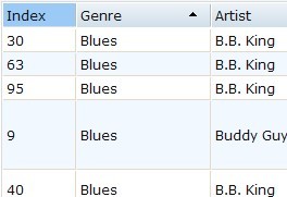
This module is in charge of the rendering of the grid header. But it should not manage column width, which is the responsibility of ColumnWidth module.
API Reference
See the Demo
Body
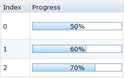
This module is in charge of row rendering. It should be compatible with virtual/non-virtual scroll, pagination, details on demand, and even tree structure.
API Reference
See the Demo
Virtual Scroller
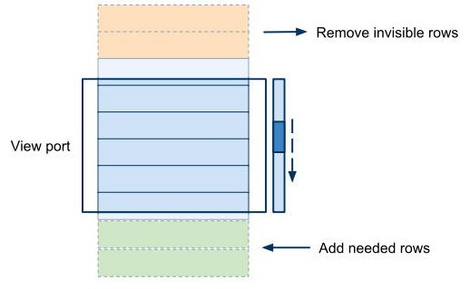
This module takes a DOMNode-based way to implement lazy-rendering. It tries to remove all the DOMNodes that are out of the grid body viewport, so that the DOMNodes in grid are always limited to a very small number.
API Reference
See the Demo
Horizontal Scroller
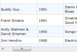
This module provides basic horizontal scrolling for grid
API Reference
See the Demo
Single Sort
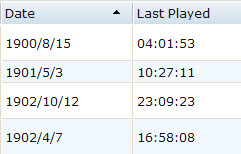
This module provides the single column sorting functionality for grid.
API Reference
See the Demo
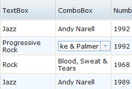
Editable Cell
This module relies on an implementation of the CellWidget module. The editing mode means there will be an editable widget appearing in the grid cell. This implementation also covers "alwaysEditing" mode for grid columns, which means all the cells in this column are always in editing mode.
API Reference
See the Demo
Pagination
This module does not include any UI buttons for pagination, so that various kinds of pagination UI implementations can benifit from this module.
API Reference
See the Demo

Simple Select
There are three modules for simple row/column/cell select. These modules only allow to select a single row/column/cell in one time. If need multi select, use extendedSelect instead.
API Reference
See the Demo
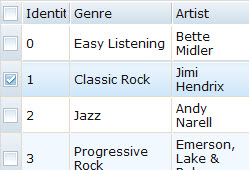
Indirect Select
This module will check whether the SelectRow module provides the functionality of "select rows by index" (which means the "selectByIndex" method exists). If so, a "select all" checkbox can be provided in the header node of the row header column.
API Reference
See the Demo
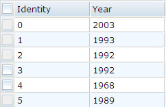
Unselectable Row
This module allows to disable selection for some of rows.
API Reference
See the Demo
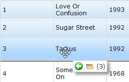
Row DnD
This module provides an implementation of row drag & drop. It supports row reordering within grid, dragging out of grid, and dragging into grid.
API Reference
See the Demo
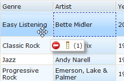
Column DnD
This module provides an implementation of column drag & drop. It supports column reordering within grid, dragging out of grid, and dragging into grid.
API Reference
See the Demo
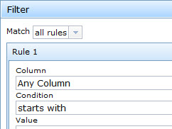
Filter
This module makes it possible for user to set arbitrary filter condition to grid. It is used by an UI module FilterBar which provides the interface to set filter rules.
API Reference
See the Demo

Cell Widgets
Since widget declarations need to be parsed by dojo.parser, it can NOT be directly created by the decorator function. This module takes advantage of the _TemplatedMixin and the _WidgetInTemplateMixin so that users can write "templates" containing widgets in decorator function.
API Reference
See the Demo
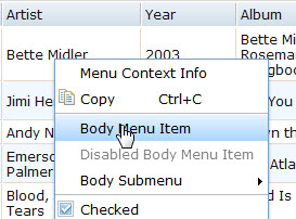
Menus
This module provides grid context menu. The context could be cell, column, row, header, body etc. All information is passed to menu actions by callback arguments
API Reference
See the Demo

Persists
Provide a mechanism to persist various grid features when the grid is destroyed, so that when a new grid with the same id (or the same persist key) is created, all these features will be restored.
API Reference
See the Demo
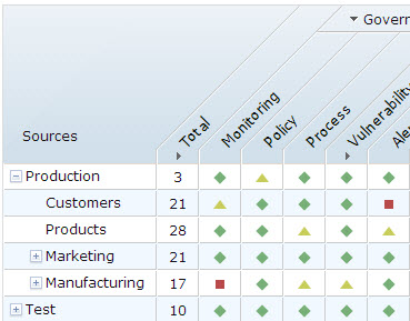
Slanted Header
This demo shows how to use ExpandableColumn and SlantedHeader modules to construct a grid with slanted headers, which is useful for displaying a grid with long column headers but small cells.
API Reference
See the Demo
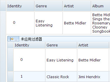
Nested Grid
This demo shows how to embed a nested grid in a Dod module. By this feature and custom css you can simulate complicated rows as you like.
API Reference
See the Demo
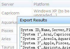
Export/Print
This module provides the API to print grid contents or provide print preview
API Reference
See the Demo
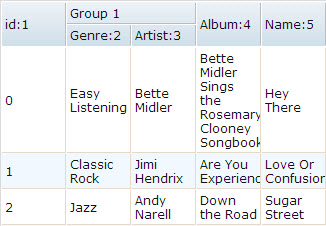
Group Header
This module allows to show group headers, which means a hierarchical structure of the header
API Reference
See the Demo
Nested Sort
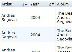
This module provides the UI to sort the grid by multi columns. Each column header shows a number indicating the sort order.
API Reference
See the Demo

Column Lock
This module provides a way to lock consecutive leading columns.
API Reference
See the Demo
Row Lock
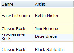
This module allows consecutive top rows to be locked. It could only be used with sync vertical scroller.
API Reference
See the Demo
Details on Demand
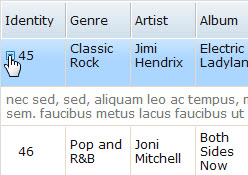
This module allows a row to be expanded to show details. An arrow is displayed in the first of each row and clicking it will toggle detail display.
API Reference
See the Demo
Extended Select
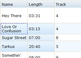
This module provides the capability to select multi rows/columns
API Reference
See the Demo
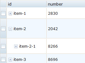
Tree Grid
This module is used for creation, destruction and management of the Tree Grid. There are two kind of Tree Grid: columnar or nested, it will be indicated by the argument `type`, and the layout of the TreeGrid will be defined by extended structure` argument.
API Reference
See the Demo
